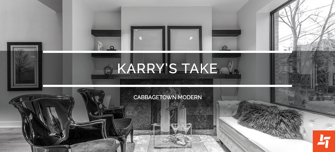
Karry’s Take – Cabbagetown Modern
Harmonizing different styles, no matter how different, is always possible with a clever design. Give us a call for a consultation and bring a fusion style to your home.
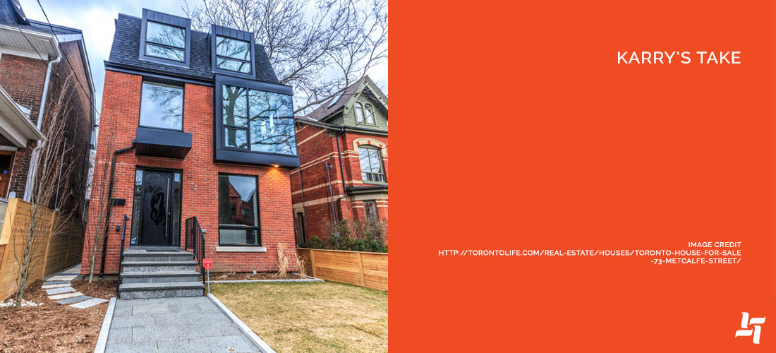
An original 1950s Victorian in Cabbagetown got the modern update we all dream about. With a fascinating blend of traditional and modern, that front exterior speaks for itself.
The Space
This home was originally purchased before the renovations for $940,000, but is now worth just under $2.5 million. Talk about getting your money’s worth! The renovations were done to the exterior and interior parts of the home, making this one both move-in ready and ‘let me move in already’.
Oh, and just wait until you see these built-in master closets!
What We Love
1. The entire top floor — There’s so much to love in this house that we had to group the top floor as one. A seriously master bedroom, gorgeous ensuite and an unbelievable walk-in closet that joins the two!
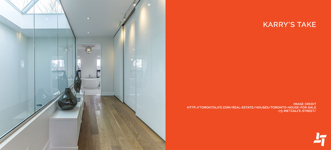
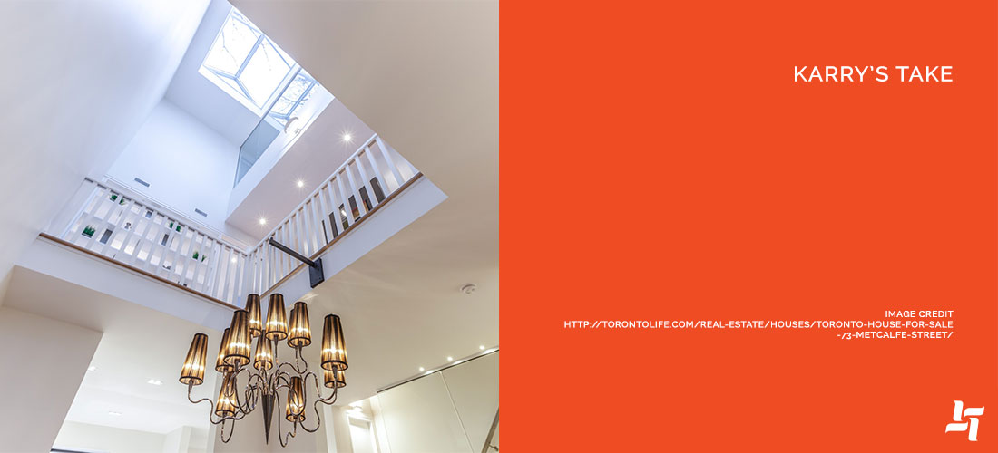
2. High ceilings with skylights — The only thing we love more than high ceilings are high ceilings with skylights. Look at all that natural light flooding the entire house.
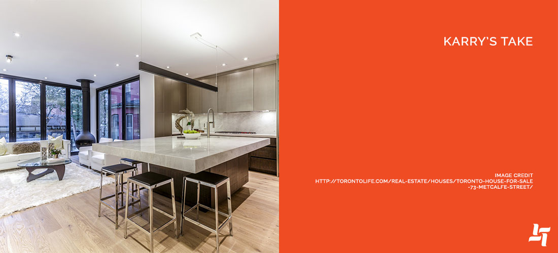
3. Commercial kitchen — Go big or go home. With commercial strength kitchen equipment, an open concept, and oversized island for entertaining, this space could feed the royal family.
4. Floor to ceiling windows — This house makes incredible use of natural light. The floor to ceiling windows (both at the back of the home and in a few bedrooms) are gorgeous with their black trim.
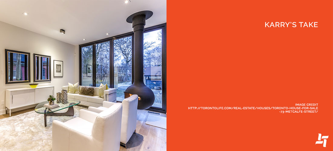
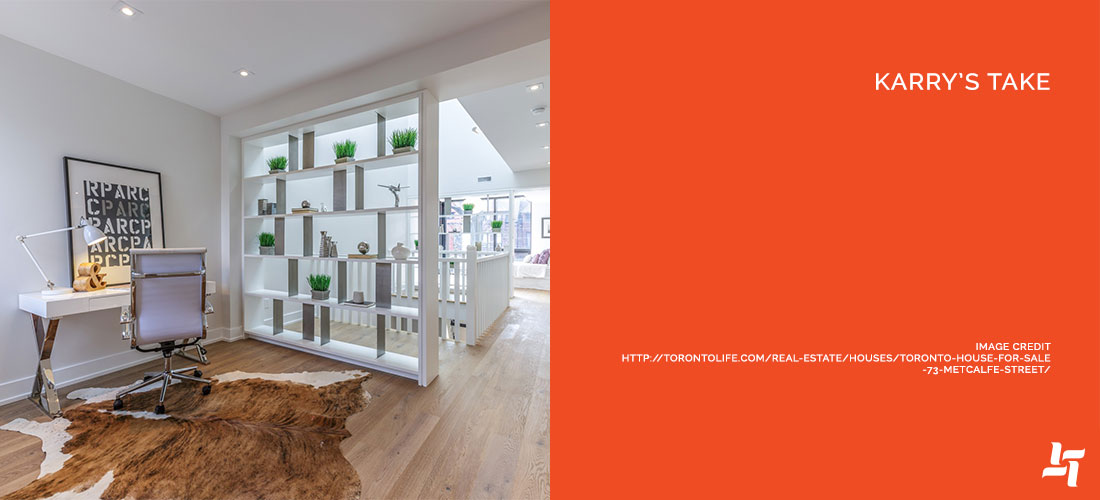
5. Clever custom divider shelving — City homes are difficult layout-wise. They’re either cramped or one long stretch. This custom divider is not only stylish, but it subtly divides the living area from the home office.
What We’d Change
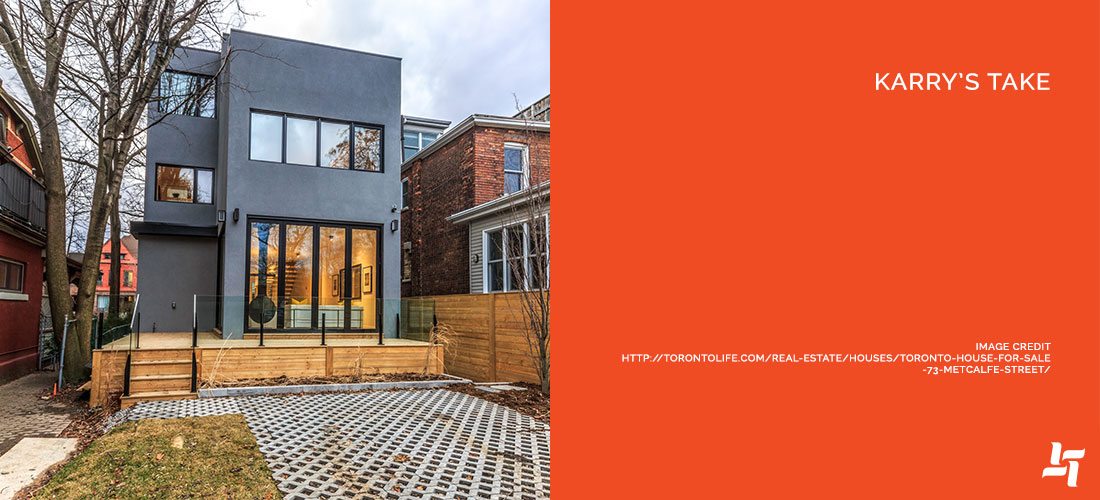
1. Tone down the moderns touches — As much as we love modern architecture, there’s something a little tragic about seeing it take over existing Victorian charm (as it does completely in the back of the house). We’d try to keep some of that charm inside the house, with exposed brick.
2. Back deck and railings — The minimalism doesn’t work for us when it comes to this back deck. It looks cool, but generally unfinished. We’d stain or paint the deck to complement the glass railing.
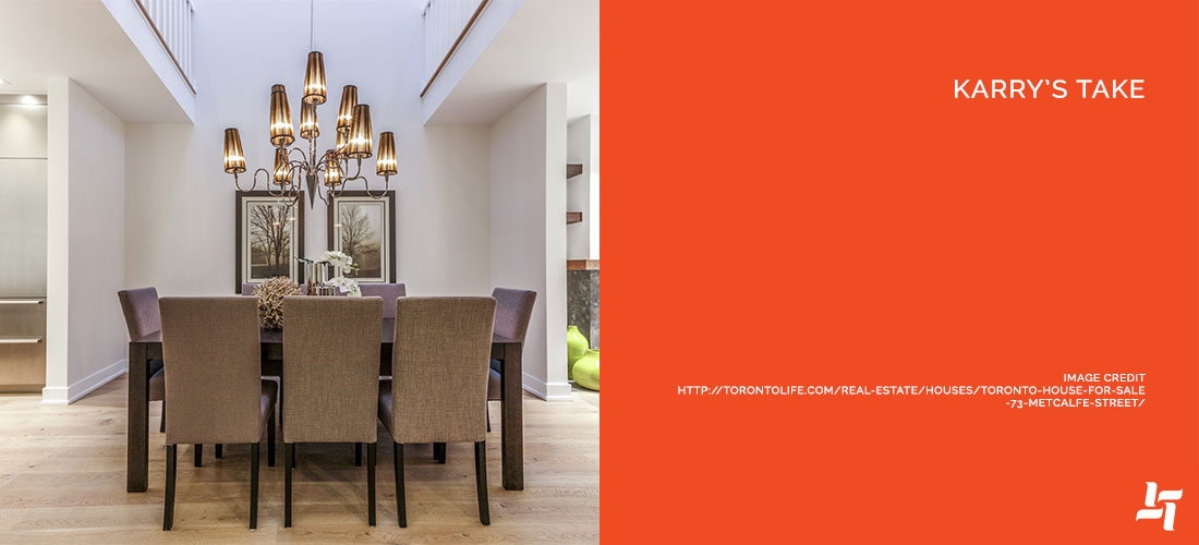
3. Main light fixture — While the large chandelier is gorgeous, it doesn’t directly reflect the modern and industrial tones in the home. We’d change it out with a wrought iron fixture or modern design.
4. More colour (especially in the kitchen) — The commercial kitchen means a lot of muted metals from the equipment. We’d bring in a small pop of colour just to break up the space. Perhaps some small pots with green herbs as a centerpiece on the massive kitchen island.
5. Literally nothing else — that’s it! We struggled to critique even this much. The homeowners did a fantastic job with this house!
The Bottom Live
This is an absolutely outstanding example of how modern architecture can be combined with traditional. While the original Victorian charm may be understated, the modern blend more than makes up for it.
We could definitely stand to live in this one. What about you? Are you brimming with ideas after this one? Share your thoughts with us!
Blog Recommendations
If you love this style, you might also like:



Sorry, the comment form is closed at this time.