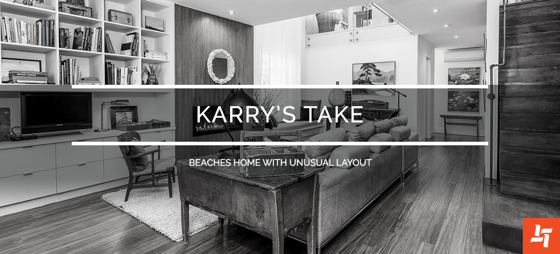
Karry’s Take – Beaches Home with Unusual Layout
Unusual layouts are common in a city like Toronto, but ones that work it well are rare. That’s why we’ve picked this home for our Karry’s Take May feature. This home has had top to bottom renovations and made the most of an unusual layout.
The Space
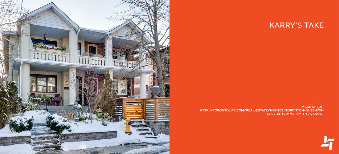
Located in The Beaches, this home tallies in at a modest $1.8 million and is a seamless blend of industrial, retro and antique tastes. The unusual layout comes from the major living quarters being located on the second floor, while most bedrooms are on the first.
What We Love
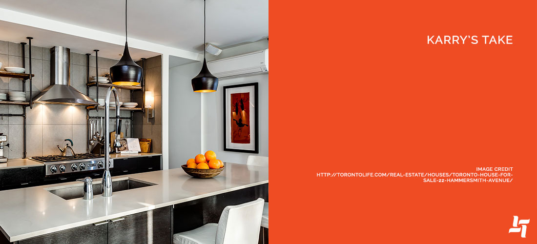
1. The Kitchen – A gorgeous modern, industrial bistro kitchen absolutely makes the entire home. From the open shelving to the pendant lights, we pick this room as our absolute favourite!
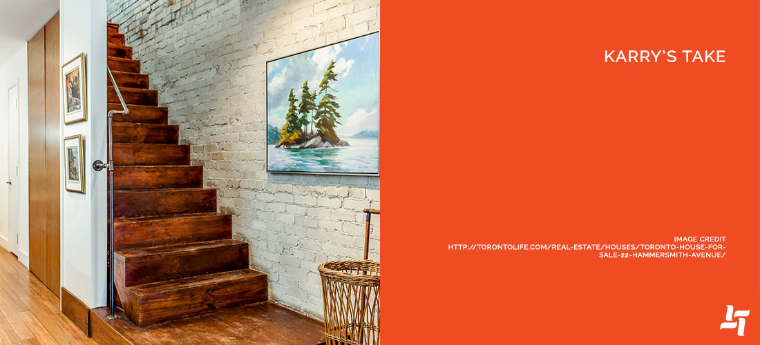
2. Exposed brick – A beautiful feature in combination with the rustic staircase. Exposed brick, painted or bare, is always a win, especially in a modern/industrial style.
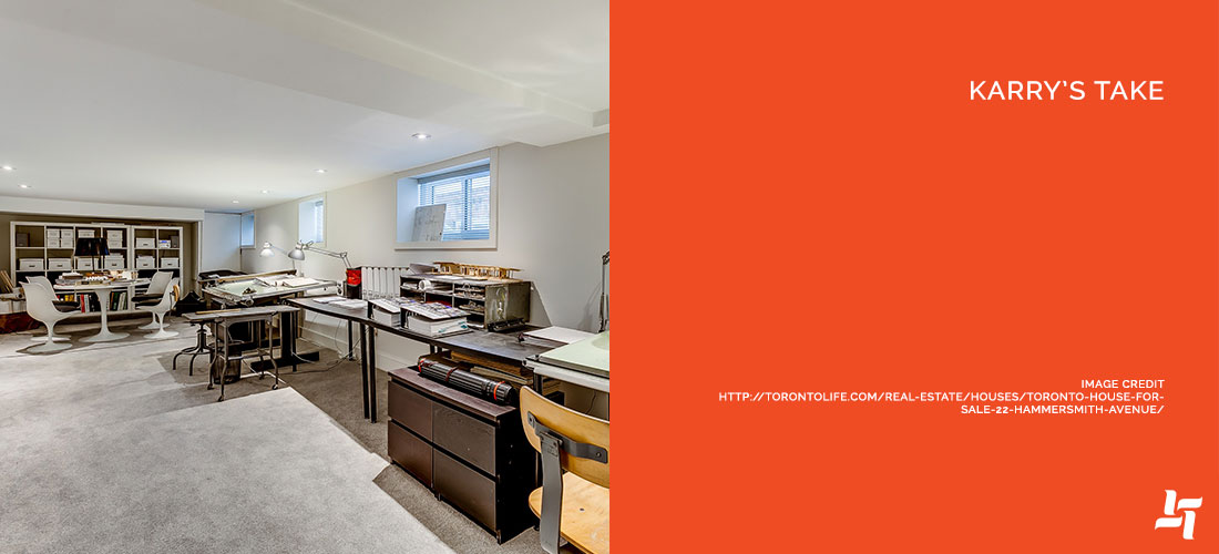
3. Finished basement – You can never go wrong with extra space. The clean and inviting finishings make the basement a huge bonus on this home.
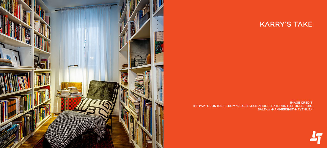
4. Built-ins – Custom built-ins are a must, that’s why we specialize in them. The shelf-lined den is especially gorgeous, as the copious shelves and books make for a cozy nook.
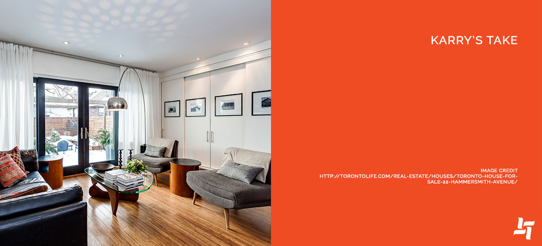
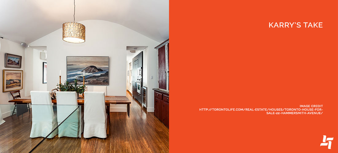
5. Bamboo floors – Not only is bamboo a gorgeous looking material (that is quickly growing in popularity) but it’s also eco-friendly because it grows like crazy!
What We’d Change
1. Rework the layout – It’s not a deal breaker, and this home sells itself on its layout, but it’s not a draw to every buyer. If the money was available, we’d rework the home to include kitchen and living on the main floor.
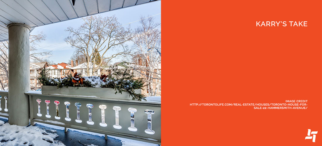
2. Update balcony – We’d update the balcony a bit, particularly the railing. For such a huge selling piece on a Toronto home, it should really pop.
3. Add more colour – Bold colour is not for everyone, but this home has a lot of neutrals and natural wood tones. We’d add a little colour in the fabrics, accessories and finishings.
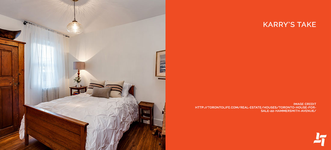
4. Slightly less wood – On the same note as colour, we’d tone down some of the natural wood finishes. For example, the bedrooms have wood floors that match too closely to some of the furniture. It’s a gorgeous finish, but the effect can be diminished when there’s too much of it.
5. Add to the basement – A finished basement is a huge sell, so we’d really turn this into a great communal space. We’d leave room for office work, which the basement is currently used for, but include an entertainment centre.
The Bottom Line
When it comes down to it, this is one of our favourite homes we’ve discussed. The layout isn’t everyone’s cup of tea, but we love how this home has worked with it. From the design, to the finishings, to that gorgeous kitchen, we’ll be taking away some great ideas from this one!
Does this Beaches home get your renovation ideas flowing? Let’s see how we can make your home just as jaw-dropping as this one!


Sorry, the comment form is closed at this time.