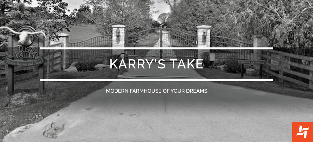
Karry’s Take – Modern Farmhouse of Your Dreams
We love browsing new luxury designs as much as you do. That’s why we’re bringing in a new blog idea! Karry’s Take is going to look at fantastic renovation designs in the GTA (and beyond, if something catches our eye!) and giving our input.
You can use this to get ideas for your own homes, to see what adds value and detracts. If you see a fantastic renovation online, send it our way to hear our thoughts (and don’t be afraid to share yours too)!
The Space
For the first Karry’s Take, we’re looking at a stunning Farmhouse near Orangeville, Ontario. Luso is a beautiful 100-acre private estate worth $3.9 Million (after you pick your jaw up off the floor, remember you can add these touches to your home without that price tag). Learn more about this property here!
What We Love
Here’s what we absolutely love about this home:
1.This space is seriously tricked out (gotta fill up that square footage somehow) – includes an arcade, theatre, bowling alley, indoor pool, a humidor, tennis and basketball courts, archery range and a zip line!
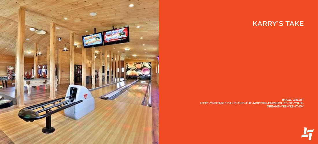
2. It makes the most of large space – vaulted ceilings, simple, clean design – which opens everything up even more.
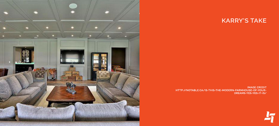
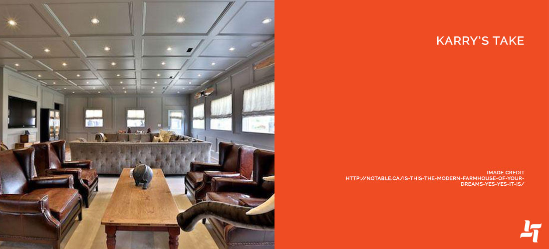
3. There big furniture – nothing more inviting than a lavish couch with plush pillows in the heart of a room.
4. The crown moulding and ceiling designs – high ceilings offer the opportunity to go big – with such a large massive room, that to have a plain old flat ceiling might be a bit disappointing.
5. Plenty of lighting – look at all those pot lights!
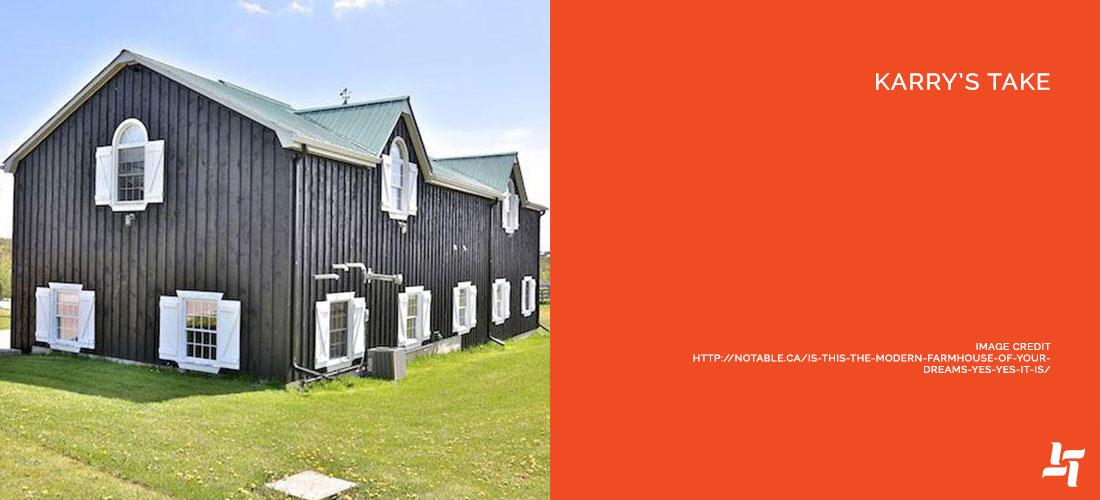
6. We appreciate that they kept the authentic farmhouse feel on the exterior – disappointing to have mismatched farmhouse interior or exteriors.
What We’d Change
Here’s what we absolutely love about this home:
1. For such a large space, the tricks and luxuries make sense, but in your average home, this is completely unnecessary. Just one of these luxury add-ons (particularly a home theatre or game room) is enough to add a huge ‘wow’ factor for a potential buyer.
2. The light-up bar counter – love the idea, but the blue-ish hue stands out from the rest of the décor, and not in a good way. We’d keep the original idea but use a purer, whiter light.
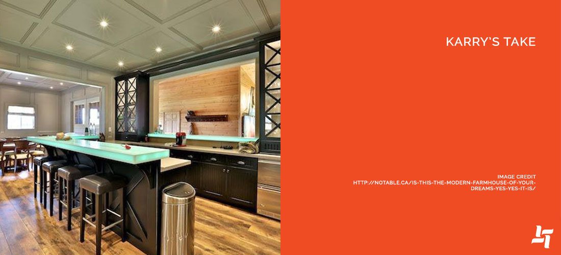
3. Paint the main living room walls and ceiling a lighter colour, like a very light, cool grey. This would open the space up even more (darker colours diminish a space and make it seem smaller unfortunately).
4. Replace the window coverings with a more modern style, and a sturdier fabric.
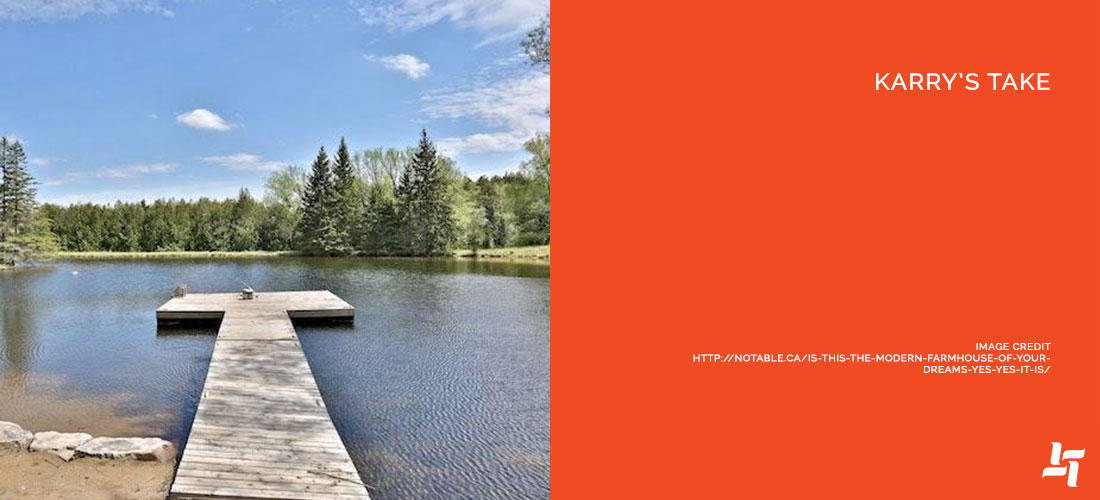
5. Add a new dock and outdoor space – if you’re going to add a bowling alley, archery range, tennis court etc., how can you leave the dock so basic?
Final Thoughts
Architecturally, this place is stunning and without reproach. The same goes for the property itself. There is so much space to be filled, and it is used wonderfully. Some of the actual design could be reworked to be a touch more modern, simultaneously emphasizing the already large, expansive rooms.
Every person’s décor preference is unique though, so these ideas aren’t set in stone. The space definitely has a huge impact as is!
What do you guys think of this Farmhouse? Would you move in tomorrow, borrow a couple ideas or ditch it all together? Tell us what you think!


Sorry, the comment form is closed at this time.